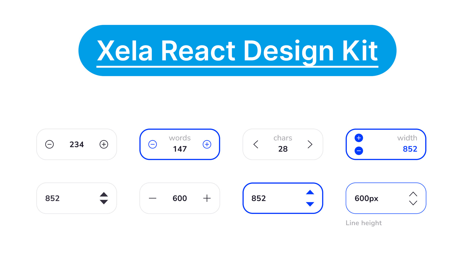
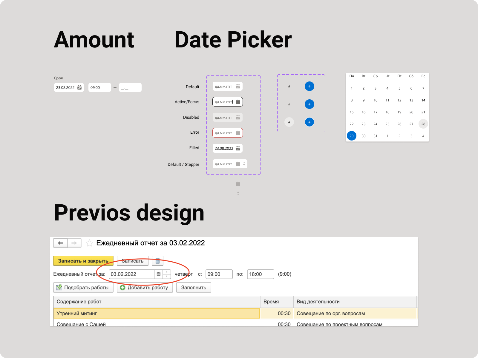
1C date picker component redesign
› In the applications of the 1C ecosystem, platforms 1C: Enterprise 8.x there is a component called "input field with a regulator" (screenshot is attached — "Previous Design").
› It can be applied to numeric sets and to text sequences.
› Such a field can be located on the form, or it can be located in an editable table cell.
› Can be used in both web and mobile applications.
› It can be applied to numeric sets and to text sequences.
› Such a field can be located on the form, or it can be located in an editable table cell.
› Can be used in both web and mobile applications.
Solution
I should submit my vision of this component for input:
› dates
› text listings (Monday, Tuesday..)
› numbers (ordinal) for example in online stores
› dates
› text listings (Monday, Tuesday..)
› numbers (ordinal) for example in online stores
The states and interactions with a given field type must be understood.
I made a research through various design systems and UI Kits and decided to get 2 examples where I found the right solution and which I can adopt to 1C new design system.
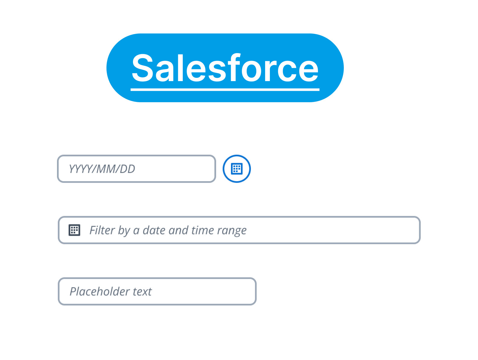
salesforce design system https://www.lightningdesignsystem.com/