
Role: Designer
Team: 1 Designer, 1 PO, 1 PM
Duration: 2 months
Tools: Figma, Google Forms, Illustrator, Tilda
Project scope
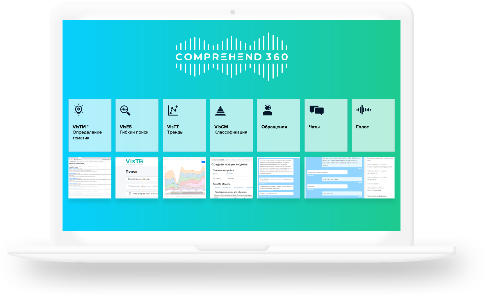
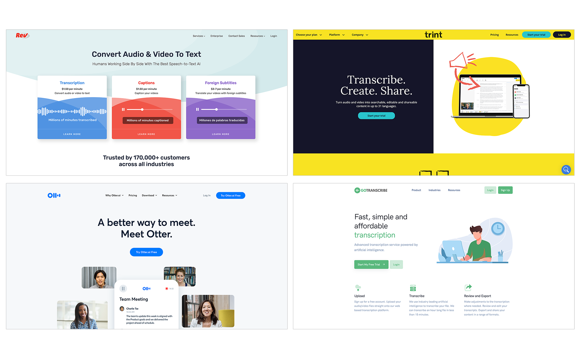
Comprehend 360 is a powerful platform that allows transcribing audio and video streams into text using artificial intelligence.
Target audience: Journalists, Researchers, Podcasting, Marketing, Coaches, Healthcare, Government, Education, Jurisprudence
Challenge
Create new landing page to run customer development:
1/ Discover new clients and market
2/ Give clients online presentations and capabilities of the platform
3/ Knowing how to book an appointment or inquire about services
Solution
I researched and redesigned the presentation to the landing website:
1/ Provide service details, including pricing
2/ Have simple, organized architecture
3/ Provide a clear CTA to book appointments and contact the business
My role & contributions
As the sole UX researcher and designer on this project I strategized and executed on all aspects of the website redesign, from discovery to delivery.
1/ I began research by conducting a comparative analysis and a heuristic evaluation of the existing site.
2/ I also completed user interviews and user testing to identify and resolve pain points in the design.
3/ Using my research findings, I restructured the information architecture.
4/ I refined Comprehend 360's branding and created design sketches and wireframes to communicate with the client.
5/ I worked closely with the client to iterate the design and implement it into the website.
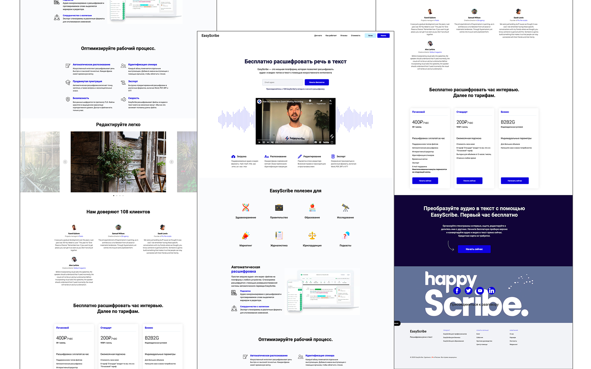
Landing website
Understanding users
To ensure the new website design was user focused, I found, interviewed, and conducted usability testing of the current site with 5 participants who have been transcribing video and audio as professionals.
Interviews
I asked the participants about their experiences shopping for transcribing audio and video.
User needs and goals:
1/ Fast, easy to use and cheap service needed
2/ Work with background noise on audio recordings
3/ Understand the technical issues of the service
4/ Details about costs, days of trial version, export formats
Usability testing
I asked the participants to complete three basic tasks using the existing website: find capabilities of service, compare prices, and book an appointment.
Pain points:
1/ Unable to book appointment online
2/ Unable to locate pricing for and services
3/ Confused by what services are offered
Analyzing the website
To analyze the existing website further, I completed a heuristic evaluation and a comparative analysis of industry competitors. I also facilitated a card sorting exercise with participants to inform new information architecture.
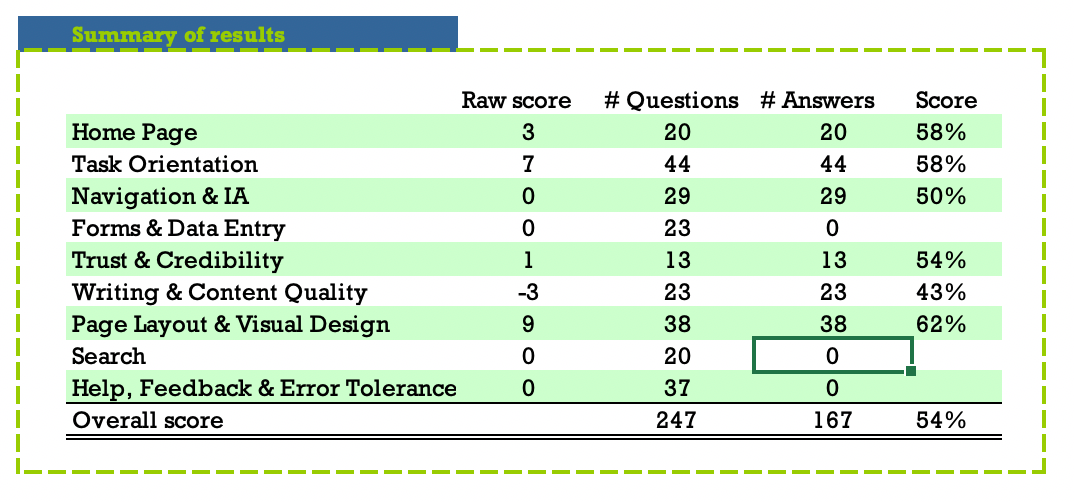
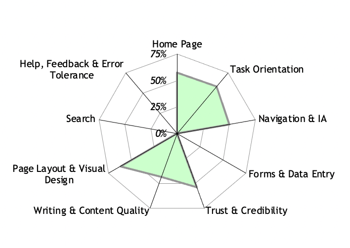
Heuristic evaluation
I evaluated the site using this scoring system which uses 247 web usability guidelines. I found that the existing site struggled with Navigation & IA and Writing & Content Quality. These findings were consistent with the insights gained during user interviews and testing. I chose to focus on these two key areas moving forward.
Comparative analysis
The comparative analysis showed that many competitors had a well organized information architecture, allowing content to be easily navigable. These websites also allowed users to book an appointment through the website. And finally, these sites made it easy to find examples of their work. These findings further supported user needs uncovered during user testing.
Translating insights to designs
Referencing all my findings, I started sketching possible page layouts and translated them into low fidelity wireframes. I implemented these designs into an appropriate Tilda website builder. I incorporated client and user feedback early and often while designing this website.